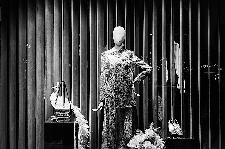
As soon as you enter the store, your gaze orients itself, your brain registers the atmosphere, your body moves towards what has attracted your attention. It only takes a few seconds and the color has already done its job: it has guided perception, created expectations, suggested an emotion.
In visual merchandising, color works as a system of signals. It builds paths, highlights products, sets the tone of the experience. It is a design element, not a simple embellishment. And it takes method, study and coherence to integrate it correctly into the store.
Let's discover together how color can become a visual merchandising tool and how to structure the store layout to intelligently influence the emotional response of customers.
The power of colors on the mind: perception, emotion and behavior
Colors act as direct stimuli to the brain. They require no words or time to understand: they trigger instant reactions that influence the way a person moves in space, observes what surrounds them and makes decisions. This apparently automatic process is the basis of visual psychology applied to retail, and is part of a broader emotional marketing strategy.
In visual merchandising, color represents a highly sensorial design lever: each color choice, if calibrated with precision, can amplify the brand's identity, dictate the pace of the purchasing process and modulate the atmosphere perceived by the customer. Inserted into a coherent context, color works in synergy with lights, textures and even background music, helping to build an immersive and coherent experience.
There is a solid theoretical basis to support this approach: Johannes Itten's theory of color contrasts, which is configured as a color circle capable of codifying the relationships between colors and their visual effects. Itten identifies seven fundamental contrasts, including complementary, light and dark, color itself, quantity, and so on, that offer concrete tools to use to build harmonies, create focal points, and define a visual hierarchy within the exhibition space.
Applying these principles means choosing which colors to include, where to place them, and how to make them interact with each other. The goal is to create balance or visual tension, silence or movement.
The power of colors in visual merchandising: each has its own meaning
The chromatic arrangement influences the gaze, the permanence, the perception of value. In a well-designed environment, the color orientates and involves, exactly like a soundtrack or a material detail.
Each shade activates a very specific emotional response. Some accelerate, others relax; some stimulate attention, others reassure. Here is how the most used colors in visual merchandising work:
- Red: Associated with energy and passion, it can stimulate urgency and excitement, making it ideal for promoting sales or products on sale.
- Blue: Evokes calm and trust. It is often used in environments where you want to convey professionalism and reliability, such as in the banking or technology sectors.
- Yellow: Symbol of optimism and youth, it attracts attention and can be effective for highlighting promotions or new collections.
- Green: Represents nature and tranquility. It is particularly suitable for stores that sell ecological or organic products, transmitting a sense of health and well-being.
- Orange: combines the energy of red and the vivacity of yellow, conveying enthusiasm and creativity. It can be used to stimulate impulse buying.
- Purple: associated with luxury and sophistication, it can elevate the perception of the brand, making it suitable for premium or exclusive products.
- Black: symbol of elegance and power, it is often used to communicate exclusivity and high quality.
White: evokes simplicity and cleanliness, but also elegance, ideal for creating minimalist spaces and highlighting products.
Benefits of using the right colors in visual merchandising
Inserting the right colors into a store layout means working on communication levels that are often invisible but extremely effective. This is where visual merchandising becomes strategic planning to allow the addition of color elements to improve the performance of the space and multiply the sales potential.
In particular, its advantages are:
- Brand recognition: a well-constructed palette creates visual coherence and strengthens the store's identity. Customers associate shades and combinations with a specific world of values, making the brand more recognizable even outside the store.
- More immersive experience: colors convey immediate sensations that influence the way the customer experiences the space. A well-orchestrated environment in terms of color stimulates curiosity, encourages interaction and transforms the purchase into an experience.
- Management of flows and focal points: the color arrangement can guide movements within the store. Some areas attract, others relax, others signal a transition. Color helps to structure a logical path, even in the absence of explicit indications.
- Product enhancement: well-studied combinations highlight textures, materials and details. Some shades enhance the brightness of an object, others make it more sophisticated. Color becomes an integral part of the product's narrative.
- Rapidly adapt to seasons and trends: modulating the palette based on the time of year or new trends keeps interest alive without revolutionizing the layout. A few targeted interventions – a background, a frame, a panel – are enough to renew the visual impact and stimulate attention.

From theory to practice: strategies for applying the right color in the store
A good color project is born from a clear intention: what the space must communicate, what reaction you want to obtain, which products must stand out. Theory offers the tools to build effective harmonies, but it is in the physical space that color takes shape and becomes language.
Here are five concrete strategies for applying the principles of color theory in the point of sale.
1. Coordinate palette and brand personality
The first step is to reduce the brand identity to color, shape and atmosphere: this is where every coherent visual project starts, capable of reinforcing the commercial message and making the brand recognizable at a glance. Each element walls, displays, graphics must speak the same chromatic language.
Bright and dynamic colors, such as intense red or electric blue, communicate vitality and are perfect for sports shops or tech brands. Warm and velvety tones sand, deep black, teal instead speak of elegance, tailoring, attention to detail. Visual coherence.
2. Use color to build thematic zones
Inside the store, the space must be organized into coherent and recognizable micro-environments. Color becomes a tool to separate functions and narratives, without interrupting the fluidity of the atmosphere.
You can define the “new arrivals” area with a warm backdrop, in an amber or terracotta tone, which creates a perception of novelty and attention, while an area dedicated to wellness or skincare products can revolve around desaturated greens, blush pinks or dusty beiges.
This color system guides the gaze, invites exploration and reinforces the positioning of the individual universes of the brand.
3. Create focal points with targeted contrasts
To draw attention to a product or promotion, you need a visual contrast that interrupts the rhythm of the gaze. A red shelf on a neutral wall, a blue frame around a display, a suspended element in a bright color: these are details that light up a specific focal point within the installation. No extensive interventions are needed, a well-positioned element is enough to generate an immediate focus and direct the gaze.
4. Adapt colors to the seasons and the emotion you want to evoke
Each season has a visual imagery. Using colors that recall it strengthens the client's empathy with the space. In summer, fresh and bright colors increase the perception of lightness; in winter, deep colors such as forest green or burgundy convey warmth and comfort. The intensity of the light must also be calibrated: a shade can change completely based on the type of lighting. The designer must also take into account the time, exposure and shadows to obtain the desired effect.

5. Make color interact with materials, displays and lights
Color always works in relation: a cement gray wall enhances a display with bright tones, while the same gray on a rough floor could cool the environment too much. Light, whether direct or diffused, alters the color perception and modifies the rendering of materials. For this reason, each choice must be tested in real space, evaluating combinations, reflections and finishes. Effective color is the one that holds together the entire visual system.
Common mistakes to avoid: when color complicates instead of helping
Despite its numerous advantages, color only works if it is guided by a precise logic. For example, combining too many colors without a solid visual structure creates disorder, disorients the customer and weakens the identity of the display.
Consistency between product and context is also fundamental: a palette unsuitable for the tone of the brand can convey the wrong message, alienating rather than attracting. In many cases, the error lies in the simplest detail: a background that is too similar to the color of the item risks canceling out the product instead of enhancing it. On the contrary, the absence of variations, if taken to the extreme, generates a flat space, devoid of rhythm and without focal points.Finally, color must always be tested in a situation, in dialogue with materials, lighting and volumes, because only in this way can it truly enhance the environment. In fact, the effect of the real light of the store, often overlooked in the design phase, counts more than you think: a shade that appears perfect on the sample can appear dull, cold or invasive once inserted into the space.
Colors in visual merchandising: a silent language that speaks to everyone
Color, within a sales space, transmits continuous messages. It acts in a few moments, activates visual memories, stimulates emotions. Using it consciously allows you to describe the products more effectively, but above all to build an experience consistent with the brand identity.
In a market where the customer moves by sensations as much as by necessity, color becomes a strategic, concrete and distinctive lever. Do you want to learn how to set up the store with the right techniques? The VIME master offers complete training on every aspect of visual merchandising, from the conception to the creation of effective displays, with a program that alternates theory and practice on real projects.
If instead you want to use colors for your store, contact us for a consultation!


